
Latest Insights
Unlocking the Power of Design
Designing a well-crafted homepage involves careful consideration of several key elements to ensure it effectively engages visitors and communicates the intended message. Here are the essential elements: clear navigation, concise value proposition, visual
hierarchy, eye-catching visuals, strategic use of white space, responsive design, Call-to-Action (CTA), social proof and trust, contact information, loading speeds, SEO considerations, and finally, consistent branding.
Clear navigation
The navigation menu should be intuitive and easy to find, typically placed at the top of the page or in a prominent location. It should include the most important sections of the website to help users find what they’re looking for quickly. Having the navigation wording match the page wording is super important so that your viewers know exactly where they are at all times. The use of a bolder font, darker text colour or underline is another way to take the guess work out of your design.
Concise value proposition
A clear headline or tagline that succinctly describes what the website or business offers. This should be prominently displayed near the top of the page to immediately capture the visitor’s attention and communicate the purpose of the site. A good example of this would be Voyages Tourbec Lapointe, a Québec owned travel agency: “Commencez à rêver à votre prochain voyage” which translates to “start to dream about your next vacation“, concisely stating it is a travel agency.

Not to be confused with CTA, or Call-to-Action, which is a prompt or instruction aimed at encouraging the reader or listener to take a specific action. The concise value proposition is instead a statement that summarizes the unique benefit or advantage a product, service, or offer provides to its target audience.
Visual heirarchy
The use of hierarchy to guide the visitor’s attention through the page. This includes larger fonts, bold colors, or prominent placement for the most important elements such as headlines, call-to-action buttons, and key visuals. One might say this is one of the most important elements to any webpage. Designing the page to allow the user ease-of-use
Eye-catching visuals
High-quality images, videos, or graphics that are relevant to the content and visually appealing. Visuals should support the overall message of the homepage and create a positive first impression. However, it’s important not to overwhelm the page with too many visuals, which can distract from the main message. Another note is to make sure that all visuals have been optimized for web, meaning they are a small file size, yet retain the high-quality look. Higher file sizes add to the how slowly a page will load, which will bring down your rank in Google, as well as potentially loose customers. A great tool I use almost daily is pagespeed.web.dev.
Strategic use of white space
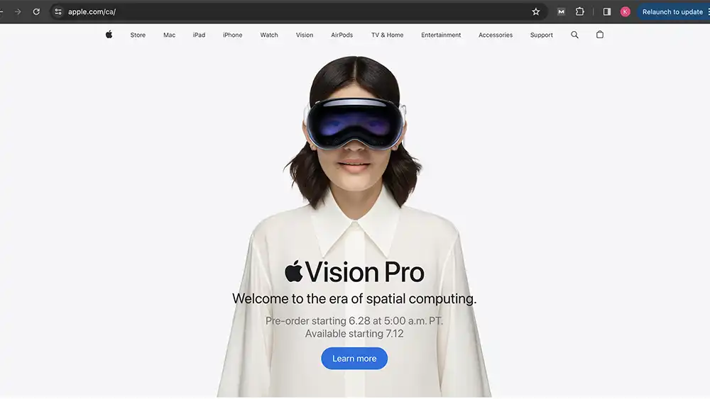
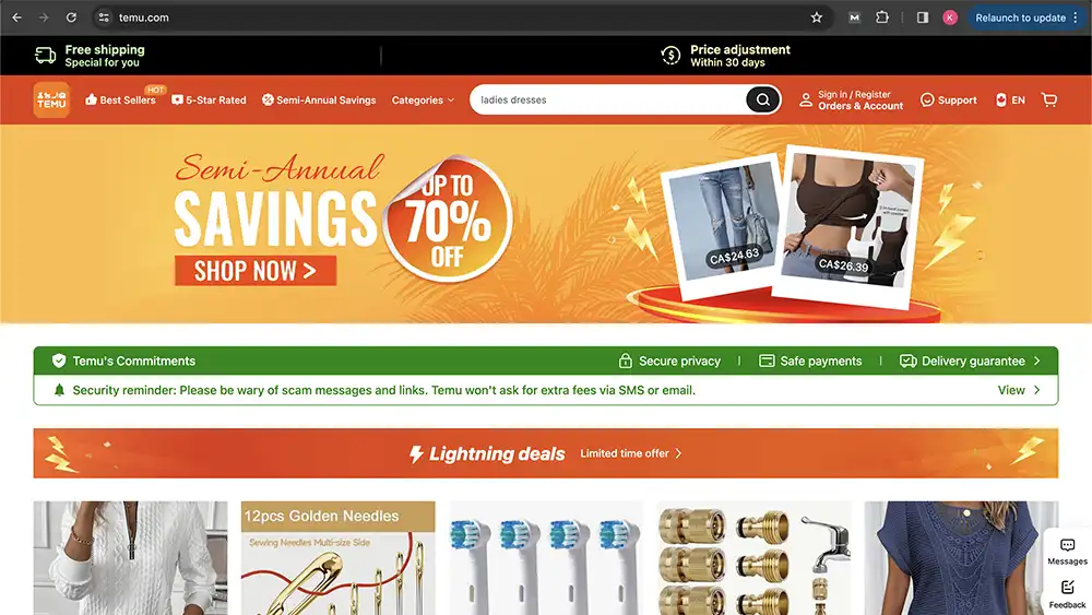
Sufficient white space (or negative space) around elements helps to create a balanced layout and makes the content easier to read and navigate. It also gives a sense of openness and sophistication to the design. White space is sometimes looked at as wasted space by some clients, but it is our jobs as designers and developers to educate these clients on how important the use of white space is. Below are two examples: Apple.ca which is know for it’s minimalistic design, and Temu.com which is overly packed with ads and CTAs which becomes overwhelming for the user.
Responsive design
Ensure the homepage is optimized for viewing on different devices and screen sizes. A responsive design adjusts the layout and content dynamically to provide the best user experience whether accessed on a desktop, tablet, or smartphone.
Call-to-actions (CTAs)
Clearly defined CTAs that encourage visitors to take the next step, such as “Sign Up,” “Learn More,” or “Shop Now.” These buttons should stand out visually and be strategically placed throughout the page to guide users towards conversion points whether that be to contact your client regarding a service or to purchase something on their ecommerce store.
Social proof and trust signals
Including testimonials, client logos, awards, or certifications to build trust with visitors and establish credibility. These elements reassure users that they are in the right place and can expect a positive experience. Tip: If you are a new business, offer your services at a reduced rate to friends and family in exchange for testimonials and reviews.
Contact information
Easy access to contact details such as a phone number, email address, or contact form reinforces accessibility and encourages potential customers to reach out if needed. Don’t forget to add a way for users to contact you, whether by phone, email, or in person (address), having no mode of contact is a big no-no.
Loading speed
Optimize page loading speed to minimize bounce rates and improve user experience. Large images or complex scripts should be optimized without compromising quality to ensure fast loading times. You can check your page load speed using a site like pingdom or pagespeed.
SEO consideration
Incorporate relevant keywords and metadata to improve search engine visibility and attract organic traffic to the homepage. SEO is extremely important especially if you don’t want to pay for ads to be on the top of Google page searches. You can use tools like Google Ads, or SEMRush, Yoast SEO, or hire an SEO expert.
Consistant branding
Maintain consistent branding elements such as logo, colours, and fonts throughout the homepage to reinforce brand identity and familiarity. There are guidelines you should follow when using brand colours in web design, the main issues are readability and accessibility. Using tools like totalvalidator, audioeye, and qualweb can help find accessibility painpoints of your website.

By focusing on these key elements, a well-designed homepage can effectively engage visitors, convey the brand’s message, and guide users towards their desired actions, whether it’s making a purchase, signing up for a newsletter, or contacting the company for their services.
0 Comments